Best and Worst Websites #1
FAU's Blackboard: Bad
Not specifically a problem with FAU, but the Blackboard platform in general is really a pain to use. The main issue, as is discussed in this essay, is that the hierarchical structure of the service means that students' needs and usage patterns are not addressed by the developers.
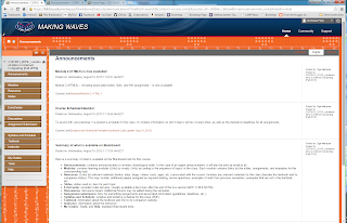
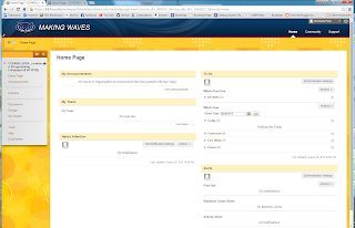
As a quick visual example, here are the home pages of the three classes I'm taking this semester. Each page has a different color scheme, landing page, and side tool bar.
The end result is a website that is difficult to navigate, is overloaded with features, lacks consistent design and functionality from one class page to the next, and requires connecting to external platforms for key tasks.
Additionally, the mobile application fails to load content reliably and has an even more cumbersome interface.
Not specifically a problem with FAU, but the Blackboard platform in general is really a pain to use. The main issue, as is discussed in this essay, is that the hierarchical structure of the service means that students' needs and usage patterns are not addressed by the developers.
This hierarchy reflects the power structure embedded in e–learning management systems: Blackboard Inc. designers and marketers who determine the learning environment’s structure; university administrators who determine which features should and should not be included as well as instructor access to managing features; instructors who determine which features should be available to students and how the class website should be structure within the platform’s parameters; and, students, who determine how they will use the interface within the structure designed by Blackboard Inc., university administrators, and instructors.When I log in, I see a home page where probably 90% of the features are unused, then click through to class pages where again the vast majority of the options are useless to me. The pages could be more useful, but that would require each instructor taking the time to train me on the particular feature set they chose and then teaching a class that utilizes those features. Furthermore, the instructors themselves require training on the Blackboard feature set provided by the university, which seems inconsistent at best. Administration adds to the bad user experience by shoehorning in extended services, like Echo Center and Lockdown Browser, rather than making use of popular existing products, like YouTube and Chrome.
As a quick visual example, here are the home pages of the three classes I'm taking this semester. Each page has a different color scheme, landing page, and side tool bar.
The end result is a website that is difficult to navigate, is overloaded with features, lacks consistent design and functionality from one class page to the next, and requires connecting to external platforms for key tasks.
Additionally, the mobile application fails to load content reliably and has an even more cumbersome interface.


0 Comments:
Post a Comment
<< Home