Thursday, August 20, 2015

Assignment Wrap-up

This was a lot harder than I thought it would be.

First off, because this blog is so old, it doesn't work correctly with the all the publishing tools available on the Blogger platform.  In particular, the new templates and dynamic options break the webpage, and using them ends up making the whole blog inaccessible.  I considered starting over with a new blog, but I'm somewhat attached to this old thing, since it's a pretty interesting time capsule from a very special part of my life.

It was also very difficult to write how I felt about websites in specific, clear terms.  Most of the websites I know and use regularly are quite good, in my opinion.  I just couldn't really explain why I liked them and what made them feel good to me.  Even more difficult was coming up with websites that I didn't like.  Perhaps it speaks to the quality of modern web development that the pages I dislike aren't broken or ugly, but simply not enjoyable to use.

This assignment also reminded me of another short-lived job I had in online publishing.  I wrote articles for a gaming website, Japan Gaming Guide, for a few months in 2011.  In the end, I only made about $50 for my work, but I had a good time documenting the gaming culture around Osaka.  Here's a link to my first article.  I posted under the name Ninjinkai, and put up about 10 articles from July 2011 to March 2012.
Best and Worst Websites #5

Seitai Doujou - OK
Seitai Doujou - Bad

My father-in-law is a massage therapist, practicing a mix of traditional eastern and chiropractic techniques, called seitai.  These are the websites I built for his business, which he runs out of a spare room.

Here's the story.  Yahoo dominates Japan's internet.  It's the king of search, obviously, but it's also the homepage of choice for most people, using it for news, email, shopping, and auctions.  Yahoo is a major internet and cellular service provider as well, its fiber optic connection is very popular for homes and businesses.  Finally, they are a web host, and still offer Geocities to Japanese customers.  My father-in-law had been hosting his business's site on Geocities for years, and its age was readily apparent.  I noticed that the image link he used for his logo was broken, and since I had been learning HTML & CSS through Codecademy, offered to fix it.

The first site I made was done by editing the HTML in the Geocities template selector.  It was incredibly difficult, since I had to do all the coding in a textbox on the website.  There was no CSS, so all styling was done inline, and I didn't know enough about web development to do anything more than a few lists and divs.  Luckily, everything worked and my new version was actually an improvement - all the important business information is easy to read and nothing is broken (except the hits counter, which has disappeared since I last checked it).

The second site was worse, unfortunately.  I wanted to start from scratch and drop the Geocities template altogether.  Again, my inexperience and lack of development tools got the better of me, and I ended up calling it quits after a few weeks of trying to implement the layout I had planned.  The site is still live, and all 90 or so lines of my broken source code are easily visible.  I know I can make a much better website now, and I have done better, but it's good to see where I was just a few years ago.

Best and Worst Websites #4

Codecademy: Good

Learning to write code is tedious, time-consuming, and frustrating.  Codecademy teaches basic coding by providing short, simple lessons with specific goals and lots of help.  There are a lot of learn-on-your-own websites that teach programming and other skills, but I found Codecademy to be the most user-friendly and economical (it's free).  Being able to write and run code in the browser, without installing dev kits or plug-ins, makes it easy to drop in for 20-30 minutes of studying and still get a lot done.  The feedback is immediate, there are rewards for progress, and the help forum is very easy to navigate should some lesson hold you up.

Design-wise, Codecademy looks and works great.  The interface uses intuitive buttons and labels, with a consistent color scheme and typeface.  Moving through the menus is quick, and it's easy to get right to what you want to learn.  The website is integrated with pretty much every social networking service out there - FaceBook, LinkedIn, Twitter, YouTube, Reddit, Stack Overflow, Instagram - making it a nice way to network with people in the software field.

I've been using Codecademy for a few years, and it's definitely helped me get started learning new programming languages and refresh my skills.  It's not as in-depth as a college course, or some of the paid sites, like Lynda or Team Treehouse, but using Codecademy has been invaluable to me in furthering my education and career.

Wednesday, August 19, 2015

Best and Worst Websites #3

Blue's News: Good

I've always been into video games.  When Quake was released in the mid 90s, I was just starting to get the hang of using the Internet and the game was my stepping-stone into online multiplayer and modding.  To stay on top of new developments in this scene, I began visiting Blue's News.

The website's design has changed very little in the twenty or so years it's been up.  No pictures are displayed in the news feed, just headlines with descriptions, links, and commentary.  There's a sidebar on the left, and a few ads bookending each day's posts.  For someone looking for the specific information this site delivers, its ease-of-use is hard to beat.  The site started as an aggregate for the .plan files game developers posted on bulletin boards, specifically focused on id Software games.  Over time, Blue's News expanded to cover the gaming industry as a whole, but still holds a strong connection to first-person shooters on the PC.

Being such an old website does give Blue's News some problems though.  The toolbar on the right side has many useless and outdated items, like LAN party listings and the once-central .plan updates.  Also, the site is not mobile-friendly, since the text-based link aggregate format is difficult to read through on a smaller screen.

Blue's News has been my homepage as long as I can remember being on the Internet.  Whenever I set up a new computer or installed a new browser, it was always the first page I visited and the first bookmark I saved.  For gaming news, no other website has been easier for me to read and navigate.

Best and Worst Websites #2

LinkedIn: Bad

Creating an online identity and developing a broad professional network are absolutely necessary in the computer industry.  LinkedIn is the best tool I know of for this goal, but it is chore to use.  Getting started with a user profile is an arduous task, as the page not only requires basic personal information, but also work experience and educational history to make you attractive to employers.  Then comes the real work of connecting to people who know you and might endorse you for a skill or write a personal recommendation.  All of this requires active participation not just on your part, but also from the people you connect with.  I understand that the objective is to build a network of mutually beneficial contacts, but it often feels so cumbersome.

The overall layout of the site, with its newsfeed, connections, and messaging, is similar enough to other social networks that it seems intuitive.  However, the site is heavy with advertisements and pushes to sign up for the paid premium service.  In addition, there seems to be a lot of spammers and scammers out to get the personal information of job seekers.  Browsing jobs and companies is difficult without entering specific search terms or following companies and industries.  Privacy is a hassle because browsing user profiles sends an alert to the users you've viewed, unless disabled, which then disables your ability to see your profile views.  It makes it feel intrusive to view others' profiles.

Probably the biggest problem with LinkedIn is that people tend to see it as a requirement to finding a job, so they're not actively engaged.  Because the service works like a social network, the quality suffers if its users are not creating content.  Posting on LinkedIn is like writing a resume, and that's rarely an enjoyable experience.

Best and Worst Websites #1

FAU's Blackboard: Bad

Not specifically a problem with FAU, but the Blackboard platform in general is really a pain to use.  The main issue, as is discussed in this essay, is that the hierarchical structure of the service means that students' needs and usage patterns are not addressed by the developers.
This hierarchy reflects the power structure embedded in e–learning management systems: Blackboard Inc. designers and marketers who determine the learning environment’s structure; university administrators who determine which features should and should not be included as well as instructor access to managing features; instructors who determine which features should be available to students and how the class website should be structure within the platform’s parameters; and, students, who determine how they will use the interface within the structure designed by Blackboard Inc., university administrators, and instructors.
When I log in, I see a home page where probably 90% of the features are unused, then click through to class pages where again the vast majority of the options are useless to me.  The pages could be more useful, but that would require each instructor taking the time to train me on the particular feature set they chose and then teaching a class that utilizes those features.  Furthermore, the instructors themselves require training on the Blackboard feature set provided by the university, which seems inconsistent at best.  Administration adds to the bad user experience by shoehorning in extended services, like Echo Center and Lockdown Browser, rather than making use of popular existing products, like YouTube and Chrome.

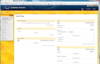
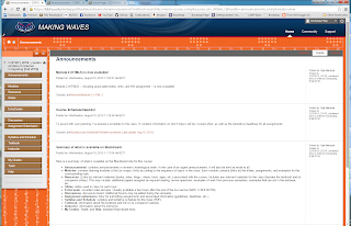
As a quick visual example, here are the home pages of the three classes I'm taking this semester.  Each page has a different color scheme, landing page, and side tool bar.


The end result is a website that is difficult to navigate, is overloaded with features, lacks consistent design and functionality from one class page to the next, and requires connecting to external platforms for key tasks.

Additionally, the mobile application fails to load content reliably and has an even more cumbersome interface.

Tuesday, August 18, 2015

Revival

It's been just over 6 years since I've posted to this blog, and a lot has changed, as one would expect.  I have a child, Jonas, who just turned 4.  My family and I moved back to the US in 2012, we're living with my mom.  My wife has a great job and is in school to be a designer.  My sister got married and just had a child, and lives in France.

I'm back in school too, as a student this time.  My career goal has shifted from teacher to computer engineer, so I'm working on a master's degree in computer science at FAU.  That's why this blog is being revived, the first assignment in my Internet computing class is to make a Blogger blog.  And, hooray!  I already have one.  Albeit massively out of date and completely off the topic assigned, but it's something.

Tuesday, May 26, 2009

Almost a Year!

So where am I now? Still in Osaka, still teaching English, still playing video games and still practicing capoeira.

My sister just came to visit for a couple weeks, which was a lot of fun. We made it all the way out to Kyushu for some nice outdoor eating, hot spring baths, and zipping along on the Shinkansen bullet trains. She did a lot more than we could keep up with, but it was good to have her around.

We're looking at taking a trip back to the states for a summer vacation, but hoping to see more of the country for Midori. We're also looking to scout possible places to live if we end up moving back sometime. I've been doing net searches for "cheapest places to live in the U.S."

Spring is rolling in around Japan....which is super late this year. The cherry blossoms came and went a while ago, but the weather is still pretty cool. We're just stuck waiting for the rainy season now.

Sunday, July 20, 2008

USA/Summer Job

The trip stateside went well, although it certainly did suck being stuck in a car for about 4 days. We flew into Orlando, made a brief stop overnight at my grandma's then drove out to Texas. Austin was great, and we really enjoyed the wedding. It was really cool to see all those friends after about 4 years.

After Texas, we drove out to New Orleans where we hung out with my mom for a couple days. There's quite a lot to do there, besides getting wasted. I'm sure I wouldn't have found that out had I gone a few years ago. We did a horse buggy tour, hit up the casino, went to a bunch of restaurants, walked around Bourbon Street at all times of day, and saw a couple I-max movies. I was really hoping to get some broiled crayfish for Midori, but we kept ending up in places that only served them fried.

The last leg of our trip was in Florida. We stayed with my sister in Tampa for a few days and hit Busch Gardens and places in the area. Midori cried on the roller coasters, she cries everywhere! We took a day to drive up to Gainesville too. We watched the bats leave the bat house at UF and took a capoeira class with my old group. The flight back was the worst, we ended up being delayed in Detroit for like 6 hours!

This summer is "teh sucks." I'm super busy, working two jobs and going to Japanese school. Still doing capoeira classes too, of course. Japanese school is going well, I really shoulda swallowed my pride and taken lessons when I first got here, rather than insisting on teaching myself. And my new job is pushing a giant soda bottle, doing a dance, and spraying water on the crowd at Universal Studios Japan. I'm in a parade (you can only see my back here, but you get the idea).

Tuesday, April 29, 2008

Five months!

Been a while, but it's time I made some effort to catch up this blog.

I'm still working at the university, but I'll be taking Japanese language classes soon. It's time I studied for real and buckled down. Hopefully I'll be able to find work in a new field or at least get a better teaching job.

Capoeira is good, I gotta start training with other groups more though. I'm pretty lazy about going to events, so I've been getting comfortable just training with the same people over and over in my school. Mixing up with new people is paramount to improving my game.

I'm still a World of Warcraft junkie. I really enjoy playing, obviously, but it would be nice to get into some other games that aren't as time consuming. Unreal Tournament 3 was a good purchase, but it's not particularly deep, just fast action. I still hit game centers too, but there hasn't been anything really exciting lately. However, a few weeks ago I very luckily stumbled onto a local area test of Street Fighter 4. The game is still months from official release, so Capcom is testing units around Japan in relative secrecy. They had posters advertising it was playable for the weekend, but cameras were not allowed and the machines were obviously not running the final game. I did get to play it, and I'm looking forward to seeing it in every arcade around town. It's got the right gameplay, classic characters, and looks great.

Midori and I took a nice vacation to South Korea last month. We stayed with a friend of mine, JP, who's doing some research at Seoul National University. Unfortunately, the plane tickets weren't very well-timed, as we arrived in the evening and left in the morning. Even with just two days to see the city, we managed to get a lot in. The highlight was our trip to the DMZ. We did a tour of the border between North and South Korea and it was nuts. North Korea is a crazy place. Seoul was great too, good food, nice sights, nice weather.

JP came to Japan just this last weekend, and we did a great tour. Saw the sights in Kyoto, Nara, and here in Osaka. Spent a lot of money, but it was a blast. Good to get out into the spring weather and enjoy the outdoors.

We're still working on our trip back to the states, looks like we've found everything for our tickets and accommodation. Now just to get it all finalized.

Tuesday, January 15, 2008

After the Wedding

Things are back to normal around here, just working, training, and playing video games. It's really cold! But I'm happy to settle into married life and looking forward to parenthood, eventually.

Here's some wedding pics!